Poetry without the smoke and mirrors

There’s a part of my brain that jerks my consciousness into an odd awareness every April.  That odd awareness is National Poetry Month.  I don’t know why the nation needs a month dedicated to poetry.  It continually ignores the medium the entire year, why should the month of April be any different.  Yet every left-leaning-scholarly-intellectual news source has to have a segment on poetry in the month of April.  Since I am a poet (albeit a very occasional one) this spotlight on my medium of choice (and torture) frustrates me as much as it pleases me.  So, in the tradition of those snooty news sources, In Develop[ment (which is me) will provide some poetry for you, whether you’ve asked for it or not.  And in protest to all poets who “give over the poem to the readers’ interpretation” I will explicitly give you the meaning of the poem and tell you not to take it for anything other than what I say it is.  My promise/challenge is this; since we are about half way through National Poetry Month I will TRY to eke out a poem a day until the month is over.  Come May you can go back to not reading poetry until next April.  Deal?

My first poem is an ode to writer, playwright, film director, and former Chicagoan David Mamet.  I’m a fan of his writing style.  I think the guy does in writing what boxers do in the ring, beat the crap out of a guy while putting on a very elaborate show.  Mamet is most famous for writing “Glengarry Glen Ross.”  Seven minutes of that film gave the salesman speech, which had lagged ever since Miller’s Willy Loman skulked onto the American stage, a much needed punch in the gut.  Mamet directed many con/heist/crime job films, my favorite genre, and has the smartest sense of timing.  The crime-speak language between the characters in these films acknowledges that the movie-going audience is smart but will always fall for anything in a short skirt.  For examples rent House of Games, The Spanish Prisoner, and Heist.

Here is the poem:

On David Mamet

Brick fisted
& cerebral.
Frowning in tones.

Don’t mean to be a bastard
but I guess I do.

Faking jabs.
Sucker punched
& duped.

It’s my way or that way
and that way ends things.

You can dust it now
but I’m making the rules
and I’ve got your nose
on a hook.

The payoff?
Well, it’s all a matter of semantics…

your cut’s been spent already.
____________________________________________________

Here’s the poem’s meaning:

In the style of a movie script, I have given the poem only two stage directions in the first and third stanzas.  The rest is one man’s speaking part of a dialogue.  It could be taken as a monologue, but not in my view.  I want to give the sense the lines are shouted Gene Hackman-style to a lesser experienced character.  There is always a novice and expert relationship to any Mamet con/heist/crime job film and this is my poem in praise of that technique.  I wrote the poem because Mamet represents a style I want to go for and that novice vs. expert relationship is one that I have with the poetry I want to write and the poetry I’m capable of writing at this time in my life.  But one day I’ll be more experienced, hard-practiced, and calloused in poetics.  I might even pull a fast one on you.

-Mike Ruzicka, i-D.

Cinematic Amnesia #2-Wall Street

Wall Street:  Lavish Hubris

“My God!  What have I done…” -David Bryne and Brian Eno, Once in a Lifetime, 1980.

The Reagan era can best be summed up musically with the band, Talking Heads.  The melodies brought vibrancy to the inherent ridiculousness of the eighties which David Byrne’s lyrics were so keen to bring up.  The Talking Heads were punk without the destruction.  The music created something out of the vast nothingness so many felt.  Very fitting then that the Talking Heads’ song “This Must Be The Place” became a default theme song for one of the most typified eighties-in-excess movie, ‘Wall Street.’  “Greed is good” became the iconic motto of Regan era self-indulgence spoken from the most attractively conniving characters written in the last twenty years.  Oliver Stone’s film and his monster Gordon Gekko became intricately linked to that decade with those words.  I would argue, however, that it was another unforgettable line that encapsulated the mood, “It’s a zero sum game…money itself isn’t lost or made; it’s simply transferred from one perception to another.”

Besides the motivation to catch myself up before the sequel is released later this year, I wanted to truly watch ‘Wall Street’ for the first time in a way that would have been impossible in any other time in my life.  It’s now 2010 and the United States has been going through a roller coaster of ups and downs in the stock market since the internet balloon busted in 2000.  I know this and have personally felt this for all of my working life.  The question I always come back to when considering the absurdity of relying the entire economic outlook on a gambling racket fraught with corruption and deceit is; why do we keep insisting on getting everything for nothing?  In the past, Oliver Stone has rightfully been accused of having a heavy hand.  Well, in this picture, his aim was and still is on target.

Perception is a damaging foe in ‘Wall Street.’  It is the perception of the good life that entices Charlie Sheen’s character Bud Fox into Gordon Gekko’s empire of fast deals, insider information, and backroom liquidation.  Michael Douglas has always brought a good amount of smarminess to his roles.  I don’t think it was mere coincidence that the two roles he will forever be known for were from the same year.  Douglas personified the man of the eighties, having it all and destined to lose it by his own vices.  It is classic tragedy and Oliver Stone played it up.  But I would also say that Stone points an accusing finger at the whole system.  Gekko and Fox had just enough hubris to get caught.  The system itself doesn’t get caught.  The Wall Street in the movie and in reality continues unscathed producing more Gekkos more Maddoffs and more schemes to create something out of nothing.  A factory manufacturing unregulated greed.

But I digress, the movie quickly unfolds the crime of securities fraud with the use of multiple split-screens, shown ‘24’ style fifteen years before ’24.’  In this early scene we see how information, the most important commodity, is used to manipulate perception and push the stock price in a company to the point where it is most profitable to the people doing the pushing.  The energy is frenetic when insider information turns to buy, turns to sell-off, and then turns to profit by the end of the day.

Also fascinating in ‘Wall Street’ was the use gold as an overall color motif for the film.  Everything was shown through a lens of a sunlit dawn.  Buildings were silhouetted by the rising sun, fashion accessories were blindingly gold, the hot girls were blond, the wives were not, high-rise apartment interiors glowed tacky gold leaf and tackier art, and money always folded into gold clips.  Oliver Stone perfectly encapsulated a world fixated by the possibilities, real or fabricated, within every “morning in America.”

I love this movie in a way that I love good heist flicks.  The characters are slick and know exactly what to say at the right moment.  I am very curious to see how Mr. Stone translates his fashionably corrupt environment of false perceptions into the internet-influenced utopian chaos that is now the modern market for the sequel, ‘Wall Street:  Money Never Sleeps.’ From the trailer, I don’t think I’ll be disappointed.  My only gripe; Stone only allows a glimpse of the human toll through Martin Sheen’s character of Bod Fox’s blue collar father caught in the middle of Gordon Gekko’s next easy money scheme.  Fox’s character transition also seemed a bit labored when he figured out the nefarious intentions of his mentor, whom he’s been following like a comic dachshund beside a bulldog for much of the film.  Seemed to me that Fox should have known he was screwed at the moment he accepted a check for a million dollars.  But that’s what perception does.  It simply transfers itself to the rosiest picture when it’s more convenient, which is the fault of most tragic heroes.  In David Byrne’s immortal words, he certainly bought some ‘wild wild life.’

-Mike Ruzicka, i-D.

Dolan Geiman – Constructing Memory’s Home

Much like kudzu found in the regions where his creative life began, Dolan Geiman’s art grows rapidly.  But unlike that infernal vine, Dolan’s works are something that you actually want to envelope a room and maybe even grab at some lost memory of an environment without concrete.  Dolan Geiman and Ali Walsh, his fiancé and partner, have carved out a balance between nature and city in their studio in Chicago, Illinois.  Reincorporating found objects and using sustainable materials in his work from conception to packaging are ongoing tenets in Dolan’s philosophy as an artist.  The personal journey into the natural environments of his own childhood is a compelling story as well.  Due to Dolan’s thankfully busy schedule, my interview with him had to be conducted through emails.  He is no stranger to blog interviews so I wanted to explore the creative terrain he uses to construct his elaborate and stunning pieces.   What is revealed is an artist acutely in tune with his voice and the living world around him.

in Develop[ment:  The repeated symbols in your work, from birds to crustacean to guitars to rusted things, are unmistakably indigenous to the southern region of the United States.  These symbols have wide appeal but I was wondering if they are more personal for you?

Dolan Geiman: “Short Trip Home” is the name of an album by Edgar Meyer, Joshua Bell, Mike Marshall, & Sam Bush. When I listen to that album, I am running down to the creek with my fishing rod. I’m crying in the tire swing at my Grandma’s in the crisp air of October.  I’m sweating in the hay loft at my Pawpaw’s in July. With each of those experiences, I was being imbued with the ingredients of my life, and for each experience I have a corresponding visual symbol that I can elicit to take me there.  Whether it’s a rotting apple on the ground filled with ants and bees, or a belted kingfisher at the creek or a rusted ford sitting in the barn, these symbols are my short trip home.

i-D:  Does some, or all, of your work tell a different story?

DG:  I think there is an overarching story being told here, of my childhood and my transition in to adulthood, but there is also a whole separate book of footnotes that are adjoining ideas and curiosities. You know, I’m so used to seeing that image of Ben Franklin with the kite and the string and the key, and I think that image is larger than life. When I see that image I think: How did he make the kite? What did the key look like? Did he try this fifty times? Was he dating some girl whose dad was a total jerk and collected stuffed birds? And so I think I want my art to tell stories of all the other curiosities that happen in life, and not just the grand performance.

i-D:  Your work is described on your website as folk art with a contemporary urban style.  Before I even read that description, my impression of your work the first time I saw it was something that transcended what I would think of as folk art.  Can you talk about the relationship or conflict between these two descriptions (folk and urban) of your art?

DG:  Growing up my mother was my greatest influence and teacher, matched only in her breadth of knowledge and her impassioned teaching techniques by my father, who, much to his own chagrin, had to give my mother center stage due to his role as the family’s breadwinner.  It was her role therefore to see that certain traditions and beliefs were exposed to me and if I chose to do so, I could carry on these particular traits, rituals, etc. Of the many teachings, I was most fond of her way of crafting and creating.  She used a few things she had been shown by her mother and grandmother but then she also invented her own techniques along the way.  And so, while something like a doorstop made from wood cut into the shape of Santa Claus might smack of uber-folk, it was passed through her vehicle of creativity and came out the other side as a more hip and creative work of craft. My mother was able to inspire in me this new tradition of taking a typical craft and turning it into a more fully fashioned work of art, and so I think it is along those lines that the world of folk craft and urban art come together.

i-D:  I know that your father was in the Forest Service and that has greatly influenced your art.  Do you see yourself as an anthropologist of sorts for the regions of your childhood?  Like a modern Audubon for rustic memories?

It’s funny that you mentioned Audubon.  There are so many times that I feel much like Audubon reincarnated.  I feel this intense and nagging desire to be greater than my body will allow.  Those are the things that keep me awake at night.  At times I feel as though no matter what I create it won’t be enough.  Most people don’t realize John James Audubon never really reached any great height of success in his lifetime.  He was a true pioneer and I can only aspire to be remembered as well as he was.  But back to reality, yes, I do see myself (on my better days) as an Audubon.  I become most excited when a memory resurfaces that I had totally forgotten about, and I get to re-catalogue it and move it into the light for closer inspection.  I remembered a few weeks ago being baptized down at Middle River Church of the Brethren.  I did some follow up research and discovered a wonderful list of other Brethren Churches and that led to another thought and then to a new painting.  One of my favorite churches was The Old Order River Brethren.  Rivers played a great part in the evolution of the Brethren Church, i.e. baptisms.

i-D:  It is possible to be a naturalist and be an urban dweller?

DG:  (laughing) I’d love to wax Thoreau here but I have to say yes.  There is no way to suddenly ‘not be’ a naturalist.  If you love nature, then you will always love it.  I have to work hard to convince myself that it’s okay to stay in the city, however.  For 8 years since I’ve been [in Chicago] I’ve lamented the loss of my childhood surroundings.  There is no way to describe the thrill of waking up in the middle of the woods, feeling totally safe, sitting by a fire and then picking fresh blueberries for breakfast.  There is no substitute.  However, I think it is much easier to be a naturalist in those surroundings.  For me it’s like saying, “Can you create a symphony on a broken guitar?”  Sure, and it will be extremely challenging and there will be something rare and beautiful in it, but it’s just different.  I’ve been really getting excited about the plethora of bird life in and around Lake Michigan, and so I’ve tried to take advantage of this.  I’ve also planted and constructed a small wildlife sanctuary in the backyard at my studio, and have been recording the numbers of birds and other animals who visit.

i-D:  Referring to the inspiration of region to your work, have you been tempted, in your art show travels, to use other environments from the US as backgrounds for your art?

DG:  Last year I visited California for the first time and it took me a year to get over the excitement. Actually, I’m not really over it.  I’d move to California in a heartbeat.  I’ve found a real connection to California, which is not hard since the landscape offers practically every possible environment from deserts to snow covered mountains.  I spent a few days in Joshua Tree.  This was my first time in any desert and it blew my mind.  My most recent paintings feature jackrabbits and cacti, and I think I might need to return to get a few more ideas…maybe next week?

i-D:  Your work has a three dimensional and sculptural quality.  You incorporate found objects and more textured materials to lay out a canvas.  Can you describe how that has evolved for you?

DG:  When I create, I create in groups, or flocks of art. I don’t want my paintings and constructions to become lonely, so I create about five or six works at a time. Actually it’s more about the creative process than any altruistic desires for the works themselves. I have to keep a few works going at a time, so if I get stuck on one piece, I can jump to the next piece and not lose my rhythm.  Rhythm is very important for me.  I’ve never had a time in the past ten years when I wasn’t working on something. I can’t afford to let time get the upper hand.  So, when I started creating paintings and collages to sell, I was making them all flat, and that was fun, and then I discovered the beauty of working on wood, thanks to my pal Leo Charre.

Leo and I were living in a warehouse in Stuarts Draft Virginia, and he asked me to get some wood for him to paint on.  I remember I got the wood and brought it back to the warehouse and he wasn’t there. We were getting ready for a show I was about to print a bunch of posters and instead I impulsively printed them on that wood.  I loved the surface and the texture, and thought it had so much more personality than paper and it was easy to obtain.  I got really excited about it.  At the time, there weren’t a lot of commercial artists doing silkscreen for art, except maybe Shepard Fairey.  Most of my peers weren’t into making art specifically to sell anyway.  Now everyone and his brother do that stuff.  But at the time, it was a new medium for me.  I stopped working on paper and for six months only worked on wood.  I developed a relationship with it and started to realize fully the potential of wood as a great medium.

i-D:  And the response?

DG:  The response of my work when I first started working on wood was great. People loved the wood, and it was different than what they were used to.  Especially in Virginia, where the juxtaposition of silkscreen and wood was the perfect pairing of urban and folk.  Now, it’s funny, but since I feel like everyone is creating on wood, I’m really determined to switch mediums.  I might even return to paper in more three dimensional forms.  I believe the key to any medium is experimentation.  When things get comfortable, it’s time to change perspective. That’s why I’m venturing into the realm of furniture this year.  We’ll see how that goes (laughing).  I think I have many loyal fans who will follow me wherever I go.  Hopefully!  If not, then I’ll just have to find new fans, dammit!

i-D:  According to your website, the origins of Dolan Geiman, Inc. started out in a sketchpad that isn’t far out of reach.  In this tech-centered world I found it incredibly comforting that a working artist’s business can still start with pencil to paper.  Do you still use that sketchbook for new ideas and developments for your company?

DG:  Truthfully, I couldn’t get far without a sketch book.  Ali and I both like to sketch out ideas, and even though she is eons ahead of me in the technology realm, we both find some common ground in putting graphite to paper.  Plus, some ideas just look better when they are framed by the blue and red lines of a steno pad.

i-D:  I know it’s been a busy year for you.  That’s a good thing right?

DG:  Indeed.  When I have time to actually think about what I’m doing, I tend to overthink and things proceed at a much slower pace.  I like things to be back to back to back and then some. If there isn’t a deadline around the corner, I start thinking about fishing on some stream in Virginia, and then I am totally useless in the studio.

i-D:  I believe I saw your art first in Nashville and then I started making my way to Chicago and saw your work all over the place.  For all of my Nashville friends out there, when will you go back?

DG:  I’ll actually be back this spring (late).  On May 22nd and 23rd my friend Maria Mariottini and I are organizing a brand new art fair down in Nashville called the East Nashville Arts Fest. Ali and I always wanted to do an art fair in Nashville, but there are not any real big street fairs.  So we talked to Maria and she said she would do it.  She is a pretty amazing show producer, so we’re excited to come back to Nashville and see all our friends down there.  Nashville has always had a special place in my heart and any opportunity to get down there I’m the first to sign up.  So if you are in Nashville, come by and say hey.

i-D:  Finally, for purely selfish reasons, is there a great restaurant off I-65 between Chicago and Nashville?

There is a great BBQ joint called Stop 30, 1007 Highway 76, White House, TN. I’ve eaten there three times, I believe.  The funny thing is, this place has eluded me for the past three years.  When Ali and I first found this place, we were so excited that I took a photo.  The next year we tried to find the place and couldn’t.  And I couldn’t find the photo.  The following year we found it, but forgot to write down the location.  Trust me, when you are on the road 22 weeks out of the year, you tend to forget things.  So when I was trying to answer this question for you, I went through my photos and actually found the place.  It’s the best home cooking you’ll find before Nashville.  And their pulled pork is great, too.

________________________________________________________________________________________________________
Dolan’s Blog-Daily Dolan Geiman can be found here:
http://dolangeiman.blogspot.com/

Buy Dolan’s work on Etsy here:
http://www.etsy.com/shop/dolangeiman

Read more about Dolan on his impressive Press Page here:
http://www.dolangeiman.com/press.php

Weener Ware – Nostalgia preserved.

Coined after a nickname that stuck, Weener Ware is the result of a long partnership between Jeanmarie Petro and Barbara Tinger.  Theirs is a business built upon bringing a sense of fun into wearable art pieces.  Images from old advertisements, abstract designs, public figures, pop icons, and animals are carefully cropped and housed inside recycled bottle caps.  What takes place from there is all part of how Weener Ware has gained a well-deserved reputation for the best quality and craftsmanship in their growing medium.  I talked with Jeanmarie “Weener” Petro at an art fair in Rockford, Illinois.  This was just before she went into a 2 month self-imposed lock-down to produce as many Weeners, the word used for their artwork, to get ready for two One of a Kind shows in two cities back-to-back and a wholesale show in January.  To say Jean and Barbara are working artists is something of an understatement.  They have truly incorporated their art in every facet of their life and the results are beautiful.

weener3 weener6 weener8 weener9

in Develop[ment:  Your images to run the gamut from the everyday to silent screen movie stars & the founding fathers to abstract designs.  Can you explain your process in choosing the images you will use for your designs?

Jeanmarie Petro: Well, the images come from whatever turns me and Barbara on…which is a lot.  We enjoy everyday things.  We have a lot of food images too.  We like things from the past, retro things, that whole design aesthetic.  We try to make everyday things special.  When people come into our booth and look at our stuff we get a lot of stories about people’s childhood or memories.  And that is really so nice about doing this.

i-D:  Is there a story behind each design?

JP: Things that make us laugh things that are colorful or beautiful imagery from nature.  I like that kind of stuff…like trees and birds…

i-D:  I know a favorite of yours are squirrels…

JP: Yes the squirrels, of course, love the squirrels.  It really could be anything; it could be a label off a food can or a postcard that a friend sent me from vacation. It could be something that my grandma gave me.  She had a weird pack of sewing needles with some interesting imagery on it that I used.  It comes from everywhere…a box of tissue paper.  You can’t throw anything away in the house (laughing).  It gets overloaded sometimes.  One time, I actually collected the paper wrapping from the toilet paper at work.  It had some pretty design on it so I saved it.  Well, that’s how Weener Ware started.  I was doing collage and I collected a lot of things for that so I used the stuff that I already had.

i-D:  I know that both of your backgrounds are in art.  Specifically, Barbara’s art focuses on captivating figure drawings and paintings.

JP: Well, Barbara went to art school, I did not.  She’s been drawing since forever.  They had a very extensive drawing program in high school that she went to and from there went to college for art in Rochester, NY.  Me, on the other hand, I’m a high school graduate.  I did take some college art courses.  But I left after around six months.

i-D:  You’ve been into collages for some time though right?

JP: Yes, I’ve always been creating things since I was little.

i-D:  I know you’ve created some elaborate collages that tell stories.  So how does this art inform Weener Ware?

JP: Well, like I said, Weener Ware came out of collage.  I was already working with the resin in my fine artwork.  I was taking cigar lids, I would do a collage inside and then I would pour the resin over it.  At that time I was bartending and my friend, who was bartending with me, pointed out to me that the Becks bottle caps were really pretty.  They had this pink color inside.  So I thought that I should put something in that cap and then the resin element just clicked.  I used the resin to pour it inside the cap to cover the images like I had done with the cigar boxes.  I was just using the images alone when Barbara suggested that “these need glitter.”  Because, of course, (laughing) we’re girls and everything has to have glitter.  I only did one pour without the glitter and ever since then we had it as a part of the design.  The glitter really makes the pieces come together and give them a shine and specialness to them.  It was a collaborative process with us.  We have used our own drawings for some of the designs and we would like to do more of that.  Most of our stuff is found but we would like to add our own original work in the pieces because Barbara is a wonderful draftsman.  Her line is impeccable.

i-D:  So you see that expanding?

JP: Yes.

i-D:  How do you manage the time between the two practices of creating art?  The art you do for money and the fine art you do for yourself?

JP: I don’t manage it very well at all.  And that’s a goal–to have more time to do my collages.  I have to admit that’s been on the back burner for a while now because Weener Ware just can’t stand without us being there and doing it.  There’s such a demand.  We also sell wholesale, and there’s paperwork, and there’s researching new shows and there’s other venues.  It’s hard to find the time to get back to that original process which I miss and have plans to get back there.  I have to figure out how to manage my time better.  Not work harder, just work better.

i-D:  Is there a balance? Can you enjoy the two types of art equally?

JP: Doing the creative work, the collages, is a lot more fun for me because I enjoy the process.  For Weener Ware, the designing is fun but the process of getting the end product I don’t always enjoy.  Whereas with collage, unless I’m having trouble with the composition, that whole process of cutting the paper and pasting it down, the way it feels, I like all that.

i-D:  There are now a growing number of bottle cap accessory makers.

JP: We were the first.  I know that people work with bottle caps.  Even kids love to collect bottle caps.  It is an interesting form to work with.

i-D:  I can see the careful attention to detail and craftsmanship in your work compared to the others in the field.  Without putting you on the spot too much, I would like to get your take on this growth of your very specific medium.

JP: I think that a lot of people who have stolen or been inspired by whatever we do are doing it on the side either for fun or to make a little extra money and are not turning it into a full-time thing.  We’ve honed our craft through the years.  So you can tell the difference with our work.  I mean it’s nice that people are inspired by what you do but at the same time it’s like you want to tell them to put a different twist on it then.  Some of them are just trying so hard to do exactly what we do, even down to the images I’ve noticed.  You know, change it in some way to make it your own.  It’s like singers or something like that, it’s like they’re trying to copy a style from someone else instead of developing their own way of expressing what they want to sing.  It’s hard to notice the rip-off people in our own area too.  You’ll do a show one year and the next year there will be one person with a booth with a little section of bottle cap art.  All you can do is do the best thing that you do and try to not worry about what everybody else is doing.  We’re constantly doing new things, new images, new ways to incorporate the bottle caps into different items that we like or people would like.  You almost have to put blinders on and do what you do the best you can do it.

i-D:  Does customer input come into the process or influence you?

JP: Sure!  We listen to our customers.  Our customers are very loyal.  They have a sense of fun.  And if there is something specific that they would like to see that we would do anyway and would fit into our collection then, yeah we make an effort to put it out for them.  We want to make them happy.

i-D:  So you make mental notes on wanted designs?

JP: Yeah, sometimes we’ll make notes at a show.  We don’t always get to it or some suggestions will just be a no, we’ll never do that.  But if it is something we would do anyway we make an effort.

i-D: Are there images you will not use no matter what the demand?

JP: I’ve had people who want us to do Chicago Bears or Cubs stuff.  I feel like there’s enough mass-marketed stuff out there with those logos on it.  I know that people would buy it and I know that I would sell it but I’m just not interested in making that sort of stuff.  People can buy a baseball cap or a button.  We’re into making something different.  I mean, where else are you going to find a Pork & Beans necklace?  Or a ham?

i-D:  That’s right, the ham always catches my eye when I see it…

JP: Barbara loves the ham.  She’s a big ham freak even though she can’t eat it (laughing)…which is ironic.

i-D:  I have noticed that some popular images and symbols have appeared in your work.  There are the peace and recycling symbols.

JP: Oh yes, but we were one of the first recyclers.  Recycling is really hot right now but we’ve been doing it since the start.  I have always been upset about landfill.  So I feel our work is making something out of garbage or something that would be thrown away anyway.  So with the recycling symbol, I found that image on the back of a cereal box and it fit the composition.  You really have to think compositionally because sometimes you see things but you know it’s not going to crop down into the space that you need so you abandon it.

i-D:  The images you use have to be small enough to fit in the bottle cap space.  I know there must be some computer wizardry involved in making it fit.

JP: We do manipulate things.  Some things need to be cleaned up and fixed at times.  Some vintage and very old designs like things that I got from my grandma, I wouldn’t want to cut them up too much.

i-D:  I wondered if you seek out smaller images for your designs…

JP: It doesn’t matter, no.  I don’t specifically look for a certain size although in the beginning we did.  But I didn’t know it was going to be a business then.

i-D:  In your process of cropping the images, some of the scenes are skewed or a bit off-center…

JP: Well who wants to be right on-center?? (laughing)  Where’s the fun in that?

i-D:  Yes, it does present a refreshing aspect of your art.  Can you go through your planning in placing the image?

JP: I might do the composition several times.  Sometimes it works straight off and sometimes it doesn’t.  And then I look at it and then assess if it say, needs more eye or the image has to come in closer or further away to get the effect that I’m searching for in that particular image.  Some days I’m really on with the designs and sometimes I’m struggling with a composition that just doesn’t come together.

i-D:  Your work has a collectible quality.  I know I have several Weeners and a pair of cuff links…

JP: …which you have to give to me so that I can reinforce the backings…

i-D:  I’ll do that!  Well, I, as well as others come into your booth at art fairs to search for the new designs…

JP: They do!  It’s nice to have repeat customers like that.  We have people that we see maybe once a year that come to our booth to see what’s new or they notice what’s new immediately.  They want to add to their collection or they want to buy gifts for people that have bought from us before.

i-D:  Can you describe how it is on the other side of the table with regular customers who find the new designs?  That’s got to be really satisfying.

JP: It is!  It’s great that people want to spend their money on what we’re making and they come back again and again.  And they’re enjoying it that much that they seek you out.  It feels good.

i-D:  Is it a motivator to get new stuff out?

JP: Well…yes and no.  Yes, I don’t want to disappoint them so I have new stuff but at the same time we get bored too.  I see stuff that I want to do all the time.  That’s the fun part of it, the design part.  The assembling of the work, that’s not so fun and there are aspects of it that I frankly don’t like but I do it for the end result.  The designing.  It’s all about the designing and finding the images.  I mean I get excited about very simple things.  I just see things that I want to incorporate into our work all the time.  It’s hard to be able to get to that.  Sometimes we’re just keeping up with what we’re doing that we can’t get to that new stuff.

i-D:  For my last question, I would like to know how it is for you when you finally accomplish a new “Weener.”

JP: (laughing) “How does a new Weener feel?”  It feels good.  I’m more enthusiastic about some designs more than others.  Every piece is different.  And you don’t really know.  Sometimes after I’ve finished the design and you do the pour, some things that you thought would be okay turn out to be really great once the resin gets on it.  The resin just magnifies it and it makes it come together.  I don’t know what I’m going to get until the glitter and the resin is on it.  You never know.  It’s all about the resin…and the glitter.  Gotta have the glitter.
______________________________________________________________________________________________________________

Shop Weener Ware online here:
http://www.weenerware.com/index.shtml

And on Etsy here:
http://www.etsy.com/shop/weenerware

Shop Weener Ware in shops listed here:
http://www.weenerware.com/stores.shtml

Cinematic Amnesia #1-Sid & Nancy

Sid & Nancy:  The Beautiful Con

Sometimes I do feel like I’ve been cheated.  I was never hard core for the Sex Pistols.  In fact, I challenge anyone who claims they were.  They entered my consciousness much like anyone’s of my age group (32-36) through a friend with a beat up cassette, an older sibling who bequeathed their record collection to us before they entered rehab, or by the curious and obvious symbols of punk culture…mohawks, chains, shit-kicking boots, etc.  The existence of the movie “Sid and Nancy” was just inevitability.  It was only a matter of time before the great swindle was dramatized.  As a kid, I had always known of the movie, much like anyone always knows Christmas comes in December or that “Rosebud” somehow equals “sled in fire.”  “Sid and Nancy” was just there.  Why it took me over twenty years to finally sit down and watch it explains why I’ve always felt cheated by my Johnny-come-lately birth year.

You see, I was just a lad when the whole thing went down.  I was probably spitting up food all over my mother’s gold owl necklace when The Sex Pistols were spitting all over their fans.  I can’t turn back the calendar and be at the first gigs or the events that defined my musical taste at this time.  So yeah John, I guess I do feel cheated.  So the movie that dramatized the quintessential punk symbols destroying themselves with excess, drugs, and fuck all was never on my radar.  I didn’t live it…why would I want to see a hallmark copy?  Yet it was the symbols of punk that moved me to put the film on my Netflix queue.

Sid Vicious and Nancy Spungen provided the punk generation its own Bonnie and Clyde.  They robbed and cheated, drank and snorted, and shot up their lives into self-destructed oblivion.  From the film, I got the sense that none of this was planned.  Here were two young bumbling assholes that lived out the con the Pistols inadvertently set up for everyone.  Twenty minutes into the movie I checked my DVD timer and was aching for Nancy’s nails-against-a-chalkboard-affected-NY-accent to be snuffed out….soon.  Chloe Webb was really the only choice for this part at the time.  Courtney Love, who auditioned for the part, would have killed the movie with melodrama much like she’s done with her own career.  What brought me to care about the movie were certain scenes when I knew I was being manipulated.  But it did not matter to me because those scenes were damned beautiful.  Two in particular stood out:

Sid and Nancy exiting the ferryboat concert broken up by the police:  This scene is so brilliant and so fake.  It really sums up The Sex Pistols for me.  Here we have the film’s idealized couple, now in actuality crossing the dock on the banks of the Thames, walking up the ramp to street level in loving embrace while the whole world collides around them but, at the same time, never touches them.  Yes, we are all pretty vacant and pretty gullible to fall for this, but I did.

Sid waking up in the Chelsea Hotel:  I think this scene typifies how many of us feel when we hit a certain age.  Sid and Nancy are in a hotel bed.  The window blinds are shut and there is hell strewn about.  Nancy suddenly realizes that she just can’t go on living like this.  Sid tries to assure her by saying everything will be alright once they get to New York.  After a pause Nancy squeals out that they are in New York and had been for a while.  Sid stammers up to his feet and opens the balcony door to realize, maybe for the first time, that he is in New York.  Gary Oldman is a great actor.  This is a fact to me.  This scene alone should prove it to anyone.  Looking at this scene with a younger version of a soon-to-be-great-actor I can see in Oldman’s face that his Sid has no idea how he got to New York, in the Chelsea Hotel, or what has transpired the entire time before he woke up.  We all have moments like this.  I hope for most or our sakes that they’re not laced with heroin.

There are other moments in the film that are disgusting, shocking, and stunning.  I have never seen trash fall around a kissing couple with so much choreographed joy.  We all know of these images.  It’s the typical rock-til-you-stab-someone-and-overdose-in-a-figurative-pizza-joint-heaven.  Somehow I think back in 1987 when the movie came out these images weren’t really new.  Yet there is always an exception when you see a movie for the first time well past its prime.  Watching Sid walk across a concrete wasteland with the World Trade Center’s Twin Towers hovering over a morning haze was something I did not see coming and left me with shed tears for something lost.  Something we can never recapture no matter how young we feel.

-Mike Ruzicka, i-D.

Circa Ceramics – Pottery “in the van!”

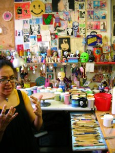
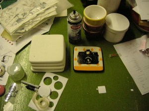
Circa Ceramics is Nancy Pizarro and Andy Witt.  They have made their livelihoods on transferring images and symbols you wouldn’t necessarily find onto common house wares and ceramic pottery.  I think they’re giving more significance to what is traditionally referred to as dishes and cups.  Their works are beautiful artifacts gaining in popularity at the art shows in Chicago every year and in my cupboard.  Below is an interview I had with them and some photos I took of their studio in the Ravenswood neighborhood in Chicago, IL.

studio-01 studio-02 studio-04  studio-13  studio-12

in Develop[ment: The first question I have focuses on the intent of my blog/project. Without revealing too much of the secrets behind your art and trade, can you talk about where your ideas are jotted, organized, referred to when you need them?

Andy Witt:  We’re trying to get to a point where we’re acknowledging that we are production pottery.  So we need to be able to maintain freshness with new images and slightly vary the colors and have a three dimensional shape to apply these ideas to and the three dimensional shape has to stay relatively standardized, like a painter’s canvas.  So we try to introduce a couple of new shapes each year just to keep that fresh but the majority of it is that we just have these blank canvases that we apply these images to and then that kind of develops the creativity from there where we are asking ourselves what kind of themes do we want to go after and what kind of audience do we want to bring in with these images….

Nancy Pizarro:  …while still keeping it affordable and attainable to, hopefully, the average consumer.  And keep it attractive as well.

i-D:  The images that you use…are they pulled from different places or do you keep a cache of images on hand or a folder of images?

NP:  Yeah yeah it’s a lot of that.  I have collections from catalogs over the years.

AW:  Well basically all the images are stored on the computer because we have to print them out in a transparency to be able to silk screen them.  So Nancy has the images in various states of completedness

NP:  (Nancy laughs knowingly) IT TAKES TIME

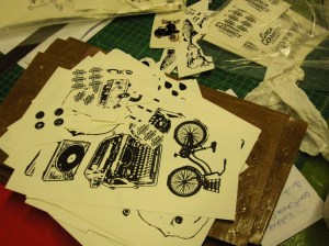
AW:  A lot of the times we’ll be at the computer researching a theme like “survivor horror video game series.”  So I’ll start doing Google image searches on pick axes and lead pipes and

NP:  First-aid kits…

AW:  Then I’ll have a collection of raw photographs that need to be converted into Photoshop…

NP:  …to try to make them print-friendly.  For screen printing usually you need a high contrast with definite sharp edges.

AW:  Yeah, we have a camera series where we take old camera images and basically turn them into clip art and we’ve found that photographers take really nice pictures of their cameras.  But then when we try to do something like a 4-wheel drive monster truck series and the quality of the image really goes down…(laughter)…because the person taking the picture will crop it in a way that the front half of the truck is missing…but you see the tires.

i-D:  right right well the tires are important to monster trucks.

AW:  So we really do rely on the person taking the photograph.

NP:  We do have customers that are very very kind and will allow us to use their imagery that they’ve sent us for custom screenings but they do fall into that category where they would chop off important things like the tires because “you really don’t need those.”

AW:  Or there’s a cat on the hood.  And then there’s two hours just trying to remove the cat.  But we will occasionally resort back to our art school training to complete images by drawing in missing elements by hand to make the image work.

i-D:  So you do sometimes make your own images?

NP:  If I really want to sit down and do it I’ll do it.  But most of the time we have so many different things going on at the same time I never have enough time to actually sit down to make two or three images.  I LOVE to do it but I don’t have time.

AW:  But it also brings up the question of what’s the difference between hand drawing something or using a tool like Photoshop to manipulate the image and I think the art festivals are finally getting into the understanding that it is a skill to use Photoshop.  It’s not this evil tool that makes everything simple.

i-D:  In a lot of imagery, like the Obama campaign icon, the artist [Shepard Fairey] got into legal trouble because he used an Associated Press photo but has argued that he actually conformed to copyright law because he manipulated the photo and made it his own.  So I was curious about your process in this respect.

AW:  We pretty much claim ignorance.  Well in the instance of a big company like Vespa Scooters or…

NP:  …or the Sanford Pencil sharpener company where I have actually encountered people from the company who get a big kick out of seeing this pencil sharpener that they still make on our pottery.  It’s just one of those things where they look at it as…

AW:  …public domain

NP:  …well no it’s not even that.  It’s that we’ve taken such a simple tool and moved it to art status.  It’s no longer a pencil sharpener it’s an icon that invokes school or…

AW:  …childhood memories.

i-D:  You are really attracted to the mundane things found in classic homes in your imagery; old appliances, typewriters, cameras, even automobiles.  How do you look at their modern counterparts?  Or modernity as a whole?

NP:  I like to think that these are the objects that we tend to forget about every day.  They’re like shoes or running water.  Really basic things.  I like the idea of being able to, I don’t want to say elevate them, but almost turning them into icons like saints in Catholicism.  Each one has its own little power in its setting.

AW:  I don’t really care for a lot of the I-products because I think there’s such a lack of design in their simplification.  It tends to look really dated after about a year or so but it forces you to buy a new product after the coolness factor wears out.  That really bothers me.  It’s really a gross aspect of today’s market.  It’s more fashion…the term fashion.  With these older products, they’ve withstood the test of time.  Whereas these newer products, it’s really hard to see how anyone would use them in ten years.  Most of them won’t even be working in less than five years.

i-D:  That’s what makes those older products classic.

AW:  I kind of hope that our pottery hearkens back to a pre-World War II mind set where things are more…

NP:  …substantial and hearty.

AW:  Yeah and where there wasn’t that much of a disposable mentality.

NP:  That’s really how we came up with our logo.  When we started we looked at other pieces and flipped them over to see where they were made.

AW:  I think it was really accidental that the Circa name fit so well with the “circa” in the images.  It was not a conscious choice.  And we’re not the only ones who use this type of imagery.  For example, some T-shirt producers.

NP:  They are other table ware producers, like us, that are small scale that do use everyday objects in a silk-screen process like ours.  But I’d like to think that our ware is…well…much more substantial than their ware.

i-D:  I have noticed that you have tended to develop your designs into more silk screened images and steered away from the floral patterns of your earlier work.  Was this a conscious choice, by customer demand, or more of an organic process?

AW:  A little bit of everything…one of the things we found out is that it takes so much underglaze which is the pigment that those images are painted on and it is very expensive.  So when you coat the entire surface it starts adding up—the money we spend to stock the pigments.  And some of the pigments don’t work very well so we end up layering these colors.  Also one pigment might be one color in June and then when we buy it again in August it’s slightly changed and it throws off the whole…

NP:  …it’s the consistency.  Underglaze consistency is an issue.  The actual glaze was an issue at times as well.  Basically, I was painting all of these pieces and it was losing its fun factor.  It was becoming a chore.  I started to dread coming to the studio and painting these pieces.  I felt like a lot of our customers were taking advantage of our flexibility with, for instance, some of the background colors.  Or asking for certain types of layouts with designs that were already laid out a certain way.  I really was not looking forward to painting them anymore.

i-D:  When it ceases to be fun that is a good way to change.

NP:  Totally!  Our customer base started to change a little bit.

AW:  The major change is when we switched from the earthenware to the porcelain.  When we started with the higher firing porcelain we lost a lot of our colors.

NP:  That was by force.  Our color palette completely changed and became more simplified.  You’ve got your core primaries and then you had a few secondaries but tertiaries were non-existent.  It really forced you to focus on what you were doing with the design.  I simplified everything.  Just the color set-ups.  I went from 10-11 color set ups down to two.  It cut back on a lot of the labor but the quality of the work was better and the durability was there.

i-D:  That does bring me to my next question.  Back in the nineties I remember seeing a lot of those pottery cafes where you spend the day painting the form and they put it in a kiln and you spend an exorbitant amount of money for that piece that you designed.  I was curious about your thoughts and how you see Circa Ceramics within this genre because it is something that many people remember?

AW:  When we started, as a means to boost production, we purchased a lot of those pre-made forms but we would paint and fire them ourselves.  Then, if we were doing a show in the suburbs we would get kids coming into our booth and say, “Oh I have a platter just like that.”  And the dad would lean to the daughter and say “well this is just like what you do.”  They didn’t even see the quality of the painting.

NP:  All they saw was the form.

AW:  The form and the color and the bright shiny glaze.  We would also see 18-30 year-old women come in and just absorb and think that they could go back and just paint our patterns.  We would ask if they were going to purchase a piece and get the response, “no I’m just going to absorb the images for a while before I go to pottery class on Thursday.”  They would spend more money trying to paint it themselves and without buying a piece they’re not going to be able to recreate it.  Now, we don’t get that so much because people don’t have any idea of the involved process.  They don’t want to learn how to silk-screen.  They don’t want to learn how to fire at hotter temperatures.  The whole paint-it-yourself pottery studios are on their last legs I think.

NP:  It’s kind of sad.

i-D:  So you do see that as a sad thing.

AW:  It’s sad because back in the eighties there was the mom-and-pop pottery store where they would make slip cast greenware and the commercial manufacturing companies where they would make the underglaze and make the glaze, they would support these mom-and-pop operations.  People would come in and paint the greenware and they would fire it.  Then all of a sudden the commercial manufacturing companies shifted and started promoting the idea of paint-it-yourself pottery studios and they would send out these kits along with a booklet on how to create your own business.  Well this, sort of, forced out the mom-and-pop pottery stores.  There was this gross transition of about four years where you would see vacant spaces and Going-Out-Of-Business signs and truckloads of slip casting molds going for a dollar a piece or haul ‘em and have ‘em “sales.”

NP:  I see it as sad because anyone who wanted to, I hate this phrase, “play with clay” would be put off by the more traditional pottery studios where people would have the university or college education behind the craft.  They see these places as intimidating and that would quash any interest that they had because they have nowhere to go that has a casual experimental environment and not feel that pressure from more educated potters.

i-D:  In referring to your own education, can you talk about how your first ideas evolved into something you knew were going to provide you with a living or was that always the goal?

NP:  We both went to Columbia College.  I was a more traditional portrait painter.  That was what I studied.  Andy was into sculpture, kind of in the ceramics media.

AW:  Yeah but it was shifting into mold making and using clay as a means to do metal casting and cement sculpture.  But it was always a priority to have a studio space.  When we moved to New Mexico we made sure our apt had 400 sq ft space to create even though it was used as storage for a good year.  I don’t know if we ever really knew if we could make a living off of our art.  It was more of, “can we make this work.”  A lot of our base ideas for pottery came from when we were working at a production pottery studio in New Mexico.

NP:  A very large production studio in Albuquerque, Kelly Joe Designs.  I was lucky enough to get a job as a painter and my being bi-lingual helped me a ton because I could retain my position and do studio managerial tasks like placing orders or training some of the new painters for bigger projects.  It was a very interesting time for both of us.

AW:  Yes, I got to do free-lance mold making.  Kelly would go out and purchase a wooden bowl and I would make a mold of it and then make a master mold of that and then make production molds so I was making money on the side and learning mold making.  At the time I didn’t know how to do slip casting or making pottery at all it was just strictly plaster work.  It was about 1998 or 1999 when we started getting our own shapes together and making molds.  I think we made about 8 bowls and we were going to sell them at a flea market to make the money to pay for our trip back to Chicago.

NP:  We couldn’t wait to get out of Albuquerque.  I’m sorry ABQ (laughing)

AW:  It was pathetic.

NP:  It was a good lesson.

AW:  The patterns…

NP:  Oh the patterns.  Just coming up with eight different looking pieces.  That was a challenge.

AW:  And I’m coming from a field where everything had to be earthy.  I’m trying to pit fire in the backyard in downtown Albuquerque.  Trying to do blackware.

NP:  Trying to hide it from our landlord.

AW:  That was really strange.

i-D:  So when you did get back to Chicago was there a specific moment that it dawned on you that this was going to be a business or was it more of a longer struggle?

AW:  I think we were just half-assing it.  [To Nancy] Did we have the small kiln when we did Queen of Angels?

NP:  We did have a small kiln.  I remember we were dabbling.  I had a lot of pieces…Kelly Joe if you happen to read this I’m really sorry.  I had a lot of pieces that I brought home with me and I had never painted because at the time in Albuquerque I had enough supplies at home that I could take the pieces home to paint.  So when we left for Chicago, instead of breaking everything I told Andy I wanted to bring them with me.  So we packed all of this greenware as safely as possible.  That’s what we started with along with some limited supplies.  We made gifts for people when we came back to just play around with it.

AW:  So we were here for just over a year and we found a show just down the street at a Catholic School, Queen of Angels.  It was like $40.00…

NP:  For an eight foot table.  It was very quaint.

AW:  We set up a bunch of stuff and we sold out of almost all of it because it was so dirt cheap.

NP:  It was dirt cheap but also, I was crazy painting back then.  I had five clip art books and I was obsessed with oriental tapestries at the time.  So I replicated them by hand on these bowls and sold them for $15.00.  People were saying it was a steal for 15 bucks!  Of course, that bowl now, with a tenth of that design, is $60.00.

AW:  But you can’t say that because the quality of the glaze, the quality of the ware itself, and we’ve grown and that growth itself is what drives the price.

NP:  But from a painter’s stand-point that bowl should’ve been way more.

AW:  Yeah, but that price is also driven by who you are and what you’ve done in the past.  It really upsets me when I see artists that jump onto the scene and then start doubling their prices and the quality is not following that increase in price.  It’s not bad to sell your pieces at rock bottom prices to figure out the industry.  I don’t think that’s a bad thing.

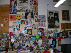
i-D:  Your studio is something that most artists strive for, that is, a space outside the home sanctuary to create and deal with the business of your art.  The space is more of a necessity for your work with the kiln, burning things, mess, etc.  Aside from the necessity, I would like to know how this space has affected your everyday life.  Specifically, is there a good balance between work and home?

AW:  When we moved back to Chicago, we wanted to have a studio space and we lucked out.  A friend knew of someone who was moving out of a studio space.  It was a 1200 sq ft converted doctor’s office.  There were a series of small 12 x 12 ft rooms that we could allocate different methods of production.  And then there was a living room and bedroom.  But the studio still bled into everything and you couldn’t really get away from it.  Luckily we had three phase industrial power but in our second or third year we bought a larger kiln that used 48 amps of electricity that required new wires.  So, without our landlord knowing we were doing this, we installed this kiln which took up the entire back room.  Our place was about 100ft long and 15ft wide.  We would fire this thing and about at the 50ft line there would be this wall of heat coming from the back room.

NP:  It was pretty awesome.

AW:  What would suck is that the place was on the second floor so we had to walk everything up and down the stairs.  So when we decided to move the business to a separate studio space.  I think I was on the toilet when I said, “Hey Nancy what about this?”  We just did it.  We started looking at spaces and within a month we were moving in.  We really lucked out with the studio here in Ravenswood because so many spaces were just so horrifying.  This space had brand new electrical service.

NP:  Newly rehabbed.

AW:  Access to the alley which made everything so easy.

i-D:  So getting to your daily schedule…as you look in shock especially after a weekend like Wells Street Art Fair.  Do you limit the time in the studio?  Do you punch out?

AW:  Well, we started to make a decision this year, we tried to do it last year, where we would say, “Fuck it, it’s not going to get done.  We’re going to kill ourselves if we go on.  If it doesn’t get done we’ll have it for the next show.”  We’re not trying to do the all-nighter.  Even with Wells Street this year, I think we got about four hours of sleep?

NP:  Yeah that’s pretty good.

AW:  Usually with Wells we would do an all-nighter and then the next morning we would end up losing money because we would be so out of it and couldn’t deal with the customers…

NP:  …and couldn’t remember who came into your booth on Sunday.  Which is so bad.

AW:  We’re trying to limit that but there’s still a huge to-do list and not enough hours in the day.  In the winter, we were doing around eight hour days so that was pretty light.

NP:  We still haven’t taken any legitimate days off though.

AW:  No.

(Nancy laughs immediately)

NP:  We try.  We do half days.  We know we need the time off so we make ourselves leave.

AW:  Or we come in later.

NP:  Yeah, we try to do a leisure morning at home.  But even then we’re still working!  We’re on our laptop researching, checking emails, on the website, etc.

AW:  When you’re self-employed these days though, twitter is…not for fun.

i-D:  In following the theme of creating a set schedule for yourself, I know there are many technical rules that you have to follow in your medium but I also wanted to know what sort of rules in creating your art you have developed over the years.

AW:  I would say we have a ton of rules.  They’re mostly unwritten.  A lot times we bounce ideas off each other like how perverted can we go with an image.  Where’s the boundary of taste?  Or where’s the boundary of social acceptance?  When does an image start to make fun of the people we’re trying to sell to?  Most of the time we don’t follow through.

NP:  Usually these ideas come from times when we’re at the computer and then one of us would come up with something saying, “Wouldn’t that be so sick to do that?”  And then we play with it for a while talking it through.  So we say it just to say it then it just goes away.

i-D:  I’m kind of half-expecting to find a cupboard of perverted pottery.

(Andy and Nancy both laugh)

AW:  Well, one of the rules is that we don’t do anything political.

NP:  Yeah.  Although the Chicago flag is a little political.

AW:  But how is it political?

NP:  Well, it’s your alliance to a city.

i-D:  I’ve seen that image tattooed on many different people I don’t think it’s political.

NP:  (laughing) Okay well then we’ll take it out of the political realm.

AW:  We try to be family friendly to a certain extent.  We hold our customer in high esteem.  We want them to love the work.  We want them to be able to display the work.

NP:  We want them to use it.  But we also know what we like.  I like skulls and I will always have skulls as a theme.  So there’s our background that comes into it and our education.

AW:  There are also rules about what constitutes a second and will we sell a second.

NP:  Oh yeah, that’s always a big issue.

i-D:  Can you explain what a second is…

AW:  A piece of pottery that just doesn’t cut it.  For a while we had images where the black was bubbling on the surface when it came out of the kiln.  We wouldn’t sell those pieces.  But it was really frustrating when we would do hand painted pieces and a gas bubble would come out of the clay body during the process, even though it would heal itself, it would still have a discolored memory of the bubble on the piece.  The glaze would be totally smooth otherwise.  We would have a customer pick up a piece and point to that mark and ask for $5 off of a $15 piece.  That did not constitute a second.  You really just have to live with marks like that due to the very nature of pottery.

i-D:  So that rule, what would constitute a second, would be very limiting.

AW:  If a piece is severely warped that would be obvious.  But it’s more of an intuitive process.  You have to ask yourself would you pay full price for that piece.  Or how obvious is that flaw.  But in our line we have set it up where the seconds would be identified so they would not go to the final stage of image application.  So there we would save ourselves the extra time…

NP:  …and the extra expense.

AW:  A lot of the times if a piece did have that small bubble mark out of the kiln we could cover it up with the image application.  I don’t think we’re hurting anybody by doing that.

NP:  Another rule that we have is that we don’t talk shit about other potters in public.  We’ve seen other potters that we respect and go to their blogs or get their tweets and they would be talking about other potters or their customers.  It…it’s one of those things where you know that’s going to come around to bite them in the ass.  Just let it go.  Vent in your private area on your own but not in public because that stuff is never going to go away.

AW:  And there’s a history.

i-D:  That is the nature of these blogs.  It’s so personal that people often forget about the very public arena of the web.  So do you find your rule about not talking ill inhibiting?

NP:  In a way.  Because sometimes when we read something we’ll wonder if they are referring to us.

AW:  It’s probably breaking my rule but when we started out using manufactured pieces but painting them ourselves or using molds that we made ourselves we would always run into the “no molds allowed in this art festival.”  We would always get shit from other potters like “do you even know how to formulate a glaze?”  Or “I would never want to sit and run a machine all day.”  But these comments are coming from people who are teaching art to children.  They’re not full-time potters.  I want to work in ceramics.  I don’t want to teach pottery.  We came up against a lot of dogmas.  We thought at around 2005 or 2006 we came out of that “mold making is bad” or “production is bad” attitude, but then we went onto Etsy.com.

NP:  Where their tagline is “Your place for all things handmade.”

AW:  And we would get slapped again with the same dogmas from the past.  We thought we went back in time five years.  It’s really frustrating to see how potters would limit themselves for their own self-righteousness.  I would like to point those people out on my blog but I refuse.  It’s like airing dirty laundry.

i-D:  Well I didn’t want to leave the interview on this note (laughing).  I’ve got one more question.  What one symbol can describe your career so far?

AW:  The upside-down cross.

NP:  (to Andy) Stop it!

AW:  Something in our work?

i-D:  It could be anything.

AW:  Our van because that was the dumbest thing we did is when we bought that van.

NP:  I love our van though.  Though most people do know us by our van.  It’s really scary.  It turned into part of our logo so I put it on as many things as possible.

AW:  Although I don’t think we live up to the whole Henry Rollins credo “get in the van.”  We’re not touring the entire country.  Sometimes we barely make it to the south side of Chicago.

i-D:  I like the image of the Van…but that’s more like leading the question.

NP:  (laughing) Stop it stop it.  Yeah, well it does take us places.  We went to Baltimore in it.

AW:  It did make us work a hell of a lot harder.
__________________________________________________________________

Shop Circa’s Etsy site here:

http://www.etsy.com/shop/CircaCeramics

Read Circa’s Blog site here:

http://circaceramics.blogspot.com/

Don’t Forget Circa Ceramics Interview published tomorrow!

Circa Ceramics interview with In Develop[ment will be published tomorrow!  For those who just can’t wait I’ve posted some eye candy.  Re-post, tell your friends, check out Circa’s website, and enjoy.  Also, sign up for In Develop[ment updates with a new and easy Email Subscription area at the right.

-Mike Ruzicka, i-D

By far my favorite coffee cup.

In Develop[ment–Launched

We all gotta start somewhere!

Human history can be read through symbols.  Depictions of everyday life scrawled across cavern walls were, arguably, our first attempts at communication.  That medium has evolved into what we appreciate or decry in art museums and galleries.  Art relies on symbols recognized or idiosyncratic.  We can see symbols in realistic or the most abstract works of art.  We see them in multi-media advertising.  We wear them on our clothes.  We emotionally recognize them in movies and works of literature.  They have been tattooed on our skin and imprinted in our minds.  Symbols, put simply, are ubiquitous.

The desire to covet certain symbols as one’s own is only natural.  We recognize something on a piece of art and selfishly desire to own that work to remind us of some part ourselves, our own personal history.  It is a pursuit mirroring that ancient practice of communication started long ago on fire lit cavern walls.

What we wear, what we use in our household, and what we display in our own cavern walls tell a story.  The artists that I talked to for In Develop[ment have dedicated their artistic careers to this pursuit.  They incorporate images and symbols into pottery, worn accessories, and wooden canvases.  The images used, or recycled as the case may be, are flourished with their own perspective.  Their creations play with recognizable symbols but not in a detached Warhol-like sense.  Their creations not only speak volumes of who they are as artists, but, by the popularity they have received from customers, also speak volumes of who we are as individual histories.

Watch this space for the following interviews at the following posting dates.  Tell your friends, spread the word and buy the work…

Circa Ceramics:  Pottery emblazoned with zombies, monster trucks, and skulls.
February 5, 2010

Weener Ware:  Incorporating collage, resin, and glitter.  One of the first and still the best bottle cap jewelry/accessory artists.
February 26, 2010

Dolan Geiman:  Much more than folk art.  Mixed media painting on wood and found objects that truly travel across state lines.
March 19, 2010

Mike Ruzicka, i-D, February 1, 2010